Color That Sells: color theory for photographers
Color is a steering wheel. When a photographer controls it, viewers glide to the subject and feel what you intended. When color drifts, attention scatters and the message gets fuzzy. The trick is to treat color as a workflow, not a preset. Decide palette before the shoot, protect it during the shoot, and reinforce it in post. This reduces correction later and creates portfolios that feel like a brand, not a scrapbook.
Pick a harmony that matches intent
Start with the story. Quiet editorial portraits love analogous palettes—neighboring hues like blue-cyan or orange-red that keep attention on expression. Energetic lifestyle ads thrive on complementary pairs—orange/teal, magenta/green—because the tension pops. Split complements are forgiving for mixed locations; monochrome is a clarity machine for brand work. Write yours down: “Warm skin, teal accents, charcoal backgrounds.” With that sentence, you’ll reject a red sign that competes with skin and hunt for desaturated concrete that flatters it. Photographers who pre-decide harmony scout smarter and dress subjects like characters in a scene, not customers at random.
Wardrobe and location are color grading
Most “grading” should happen before you shoot. A neutral jacket suppresses color chaos better than any HSL slider. If the brand color is cobalt, put it in accessories or background lines rather than on the face where it can spill and contaminate skin. Locations should be chosen for color, not just texture: warm brick can overpower fair skin; green grass bounces sickly into jawlines; pale stucco is a free fill with honest tone. A photographer who walks a block to escape green cast saves an hour later.
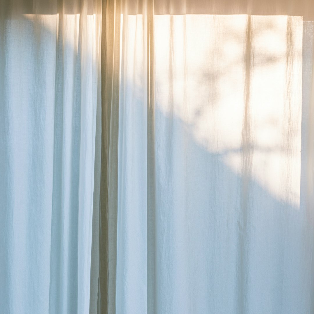
Light decides saturation
Soft light lowers perceived saturation; hard side light boosts it. Backlight desaturates edges but can glow warm highlights for a luxurious feel. If you want a punchier palette, reduce fill and let specular highlights develop; if you want pastels, lift fill and expose higher without clipping. Don’t fight physics—use it. A quick test: photograph a color card moving from open shade to a side-lit strip at the window edge. Watch the reds deepen and the blues clean up as directionality increases. Decide which version suits your story and stay in that microclimate for the set.
Protect skin tone first
Skin is the anchor. If skin looks good, viewers accept bolder choices elsewhere. Keep a small white or warm bounce card to neutralize cool skylight or green grass. For deeper skin, lean into warm side light to celebrate sheen; for fair skin, avoid heavy green or magenta contamination by keeping distance from foliage and neon. Set Kelvin instead of Auto WB so your scene doesn’t drift frame-to-frame. Aim for a consistent baseline—5000–5600K in shade, 6000–6500K under cloud—and correct once in post rather than chasing mixed values across the gallery.
Background hierarchy: subject, support, silence
Everything behind the subject is either helping or shouting. Adopt a three-tier rule: the subject color dominates, a support color echoes the palette, and everything else stays quiet. If your subject wears warm tones and your support is teal signage, keep the remaining environment gray, charcoal, or muted. Remove loud outliers—even a small red can yank attention in a thumbnail. The photographer’s job is not to include the world; it’s to design what the eye cares about first, second, and never.
Camera profiles, then global moves
Choose a camera profile that supports your palette. Flat or neutral profiles preserve headroom for subtle skin work; vivid profiles can clip channels when you push saturation later. In the raw editor, fix white balance and exposure globally first. Then nudge HSL to separate subject from environment—drop aqua saturation to calm cyan cast in shadows; add selective luminance to lift brand accents. Reserve targeted masks for hero frames; consistency matters more than micro-perfection on supporting shots. Photographers who edit in this order ship faster and keep a unified brand look across platforms.
LUTs and presets: containers, not crutches
A good LUT or preset is a container for decisions you already made on set. Build them from your best-performing jobs, labeled by intent: “Warm Editorial Soft,” “Teal & Tan Lifestyle,” “Cool Product Clean.” Apply lightly, then adjust white balance and exposure per set. If you’re constantly fixing orange skin or cyan shadows after applying your preset, the issue is capture, not post. Revisit wardrobe, location, and bounce choices on the next shoot. The photographer who iterates capture habits will need fewer corrections forever.
A color checklist that boosts conversion
- Is the subject clearly separated by hue, value, or both
- Does wardrobe harmonize with brand colors and skin
- Is there a quiet background or do I need to subtract color noise
- Did I choose light that supports saturation goals
- Is white balance consistent across the set to feel like one story
Color is not decoration—it’s navigation. When you guide it from wardrobe to location to light to post, your images don’t just look good; they work. They read quickly, they feel intentional, and they sell the message the way a professional photographer needs them to.